Decor
Earthy Color Palettes for a Calm, Grounded Home
Earthy palettes turn a house into a retreat. These four grounded color combinations — built on clay, sand, sage, and bone — create calm without ever feeling flat.
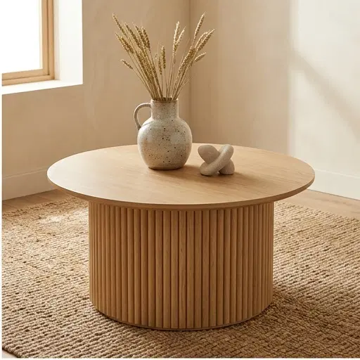
An earthy palette is the fastest route to a home that feels calm and grounded. Built on pigments drawn from soil, stone, and clay, these colors lower the visual energy of a room and let texture and light do the talking.
Why earthy colors feel calm
Earthy colors sit in the warm, low-saturation end of the spectrum — ochres, clays, sands, and sages. Because they echo the natural world, they read as restful and familiar. Low saturation also means less visual stimulation, which is exactly what a restful room needs.
Palette 1 — Clay & Cream
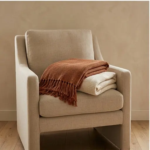
Warm terracotta walls or upholstery over a cream base. Use clay as the accent (a sofa, a feature wall) and cream everywhere else. Add blackened metal or walnut wood for contrast. This is the most grounding of the four palettes.
Palette 2 — Sand & Bone
The quietest palette. Walls in soft bone, furniture in sand, with a single warm-white trim. Depth comes entirely from texture — bouclé, linen, plaster. Best for small spaces, as the monochrome light palette expands the room.
Palette 3 — Sage & Oak
Muted sage green paired with warm oak wood. Sage as wall color or upholstery, oak for furniture and flooring, with a cream ceiling. This palette brings the outdoors in and feels especially calm in bedrooms and reading nooks.
Palette 4 — Ochre & Charcoal
The boldest of the four. Warm ochre as the accent (pillows, a single chair, ceramics) over a charcoal or deep-stone base. Use sparingly — ochre is high-energy and works best as 10% of the room, not 50%.
How to combine earthy colors
Follow the 60-30-10 rule: 60% a dominant neutral (sand or bone), 30% a secondary earthy tone (clay or sage), and 10% a single accent (ochre or terracotta). Keep saturation consistent across all three so the palette feels unified.
Key takeaways
- Earthy colors are calm because they are low-saturation and drawn from nature.
- Use the 60-30-10 rule: dominant neutral, secondary earthy tone, single accent.
- Let texture carry depth so the palette never feels flat.
Frequently asked questions
What are earthy colors for a home?
Earthy colors are low-saturation tones drawn from nature: clay, terracotta, sand, bone, sage green, ochre, and warm browns. They feel calm and grounded because they echo the natural world and reduce visual stimulation.
How do I create a calm color palette for my home?
Use the 60-30-10 rule with earthy tones: 60% a dominant neutral like sand or bone, 30% a secondary earthy tone like clay or sage, and 10% a single accent like ochre or terracotta. Keep saturation consistent across all three.
What is the most calming color for a living room?
A soft sage green or warm sand is among the most calming colors for a living room. Both are low-saturation earthy tones that reduce visual stimulation and pair naturally with warm wood and textured fabrics.
"I bought the modular sectional for a 500-square-foot apartment and it genuinely made the room feel bigger. The reconfiguration took ten minutes — no tools."
The slow living letter
Loved this guide?
Get the next one — plus a weekly curated find — straight to your inbox.
Join 12,400+ readers. Unsubscribe anytime — we keep it slow.